




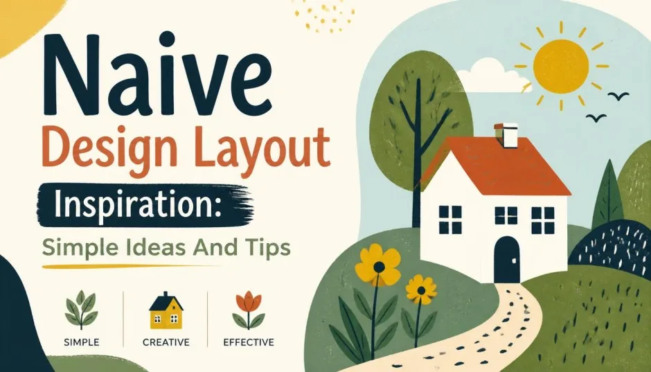
If you have scrolled through social media lately, you have probably noticed something different. Logos look hand-drawn. Lines are slightly crooked. Colors are bright and unapologetic.
Nothing is perfectly aligned. And that is exactly the point. I have been watching this trend evolve over the past year, and it is fascinating to see designers embrace what used to be considered mistakes.
This article gives you naive design layout inspiration that actually works, explains why this style is everywhere in 2026, and shows you exactly how to use it without making your work look amateur.
What Naive Graphic Design Actually Means?
The term "naive" might sound like an insult. It is not. Naive graphic design celebrates intentional imperfection. It is rooted in childlike wonder and the kind of playful charm that stands out in a feed of hyper-curated content .
Read Also: Success Growth: Why Personal Growth Drives Business Success?
Think uneven lines, squiggly shapes, flat perspectives, bright colors, smiley faces, and handwritten lettering . Something that should be far away might look just as big as the thing in front. Letters might tilt or bounce out of line. That is the point.
Naive design is not about being messy. It is about putting character over polish while still communicating clearly . The goal is to create work that is just imperfect enough to turn heads.
Here is the key insight: you know enough about design to know which rules you should keep and which are worth breaking . That is what separates effective naive design from actual amateur work.
Why Is Naive Design Trending in 2026?
This is not a random fad. There are clear cultural reasons driving the surge in naive design popularity.
The AI Fatigue Factor
Artificial intelligence can generate flawless visuals in seconds. That capability has made perfection feel cheap . When flawlessness is automated, imperfection becomes the differentiator. Hand-drawn marks signal authorship—something made by a person, not prompted into existence.
Over 15 billion AI images have been created since 2022 . Visual uniqueness is becoming increasingly rare. Consumers can sense when content is AI-generated, and many reduce engagement when they suspect it .
The Minimalism Hangover
We spent a decade looking at grayscale palettes, geometric sans-serifs, and whitespace as virtue . It communicated sophistication, but it also made everything look the same. Scroll through any brand's Instagram from 2019.
You Must Also Like: Sensory Perception Digital Art: A Guide to Immersive Design
The off-white backgrounds. The thin sans-serif fonts. The careful nothing aesthetic. Consumers now scroll past sleek sameness without registering it . When every brand looks equally refined, none of them read as real.
Cultural and Generational Shift
Gen Z grew up with doodle culture, sticker packs, and the early internet's handmade charm . Naive design speaks that visual language fluently. For this generation, nostalgia offers an alternative to constant optimization and digital overload .
Beyond Gen Z, there is a broader cultural pull. We want to return to creative expression untouched by performance metrics . That is why naive design delivers comfort through every wobbly line and bold, flat color.
Core Visual Signatures of Naive Design
Here is what makes naive design recognizable and effective:
-
Freehand, uneven lines: They look like someone drew them by hand without a ruler .
-
Asymmetrical, off-grid compositions: Nothing is perfectly centered .
-
Bold, flat color palettes: No gradients, no realistic shadows, just pure color .
-
Character-driven illustrations: Warm, quirky figures with personality .
-
Textured surfaces: Paper, paint, or crayon effects add depth .
-
Handwritten or loosely drawn typography: Letters that feel personal .
-
Smiling faces and doodle-style figures: Approachable, friendly visual language .
How to Get the Naive Design Look: Practical Tips
Creating naive design requires intention. Here is how to do it right.
Start with Handwritten-Style Fonts
Lettering that looks sketched, tilted, or slightly uneven instantly makes your design feel more human . Look for fonts with character rather than perfect geometry. Experiment with different handwriting styles and find what matches your brand's personality.
Add Doodles and Hand-Drawn Elements
Smiley faces, arrows, uneven borders, little scribbles in the margins—these details create that sketchbook feel . And yes, drawing things by hand is encouraged. If you are not a professional illustrator, that might actually help. This design trend thrives on amateur vibes.
Ditch Polished Stock Photos
Instead of using a polished photo, try hand-drawn flowers that look like they came straight from a kid's notebook . Swap sleek icons for quirky shapes. The goal is to create a sense of authenticity and human touch.
Use Bold, Vivid Colors
Big, vivid colors bring the style to life, especially when paired with flat layouts and simple shapes . Color creates emotion and draws attention in a sea of muted corporate palettes.
Balance Is Still Important
Even a playful design needs some structure. Leave enough breathing room between elements so you do not overcrowd the piece . Naive design should feel fun, not chaotic.
Embrace the "Handmade Digital" Aesthetic
Trend forecasters have identified 2026 as the year of "handmade digital" aesthetics . This is a creative mode that blends digital tools with deliberately imperfect, human-feeling outputs. The best designers are reclaiming emotion and humanity in their work while still using digital platforms effectively .
Real-World Examples That Get It Right
Oatly
Oatly is the most famous example of naive design. You see it in their wobbly, hand-drawn letters and the quirky illustrations on their cartons . Instead of looking like a sterile food company, they look like a person with a pen went to town on the packaging.
Their branding works because it breaks the rules of professional design. While other milk brands use perfect photos of splashes and farms, Oatly uses doodles. It shows they value personality over polish .
Book Covers
Book covers are increasingly featuring childlike sketches, doodles, and crayon marks . The aesthetic favors deliberate roughness over sterile polish. Writers like Madeline Cash and Cazzie David pair playful covers with serious narratives about adulthood's emotional turmoil .
The covers signal a particular emotional register—naive, sticky chaos that youth promises . The visual language recalls a simpler time and reclaims lost innocence. For Gen Z readers who collect items like Labubus, friendship bracelets, and butterfly hair clips, it is natural that art direction would follow suit .
Fashion Brands
Fashion, long steeped in traditions of craftsmanship, is welcoming hand-drawn graphic language in more visible ways . Sketch-like florals, animated bows, and imperfect linework are replacing overly perfected prints. Campaigns are leaning on artist collaborations rather than traditional fashion photography alone.
Who Naive Design Works Best For?
Small Businesses and Creators
Naive design is perfect for small businesses or creators who want to trade perfection for personality . It works particularly well for kids' brands, toy shops, party planners, bakeries, artists, and indie cafés. When being memorable matters more than being polished, naive design delivers.
Digital-First Brands
For companies that live online, naive design cuts through the monotony of perfectly curated feeds. It signals warmth and authenticity without sacrificing the reach that digital platforms provide .
Social Advertising
Naive aesthetics often help convey important social messages through simple, emotionally understandable images . Campaigns on environmental or humanitarian issues benefit from manual techniques and simplified forms that inspire trust and empathy .
When Naive Design Does Not Work?
Not every brand should go naive. Here is honest guidance:
Corporate and Financial Services
If your business relies on conveying stability, trust, and precision (banking, law, healthcare), naive design can undermine your authority. Stick with cleaner aesthetics that communicate professionalism.
High-End Luxury Brands
Luxury often relies on flawless execution and premium materials. Naive design can feel too casual and undermine the sense of exclusivity. Use it sparingly or not at all.
When Authenticity Is Missing
If your brand is not actually playful, creative, or human-centered, naive design will feel forced. This style only works when it reflects your genuine brand personality. Audiences can spot inauthenticity instantly.
Common Mistakes to Avoid
1: Being Messy Instead of Intentional
Naive design is not an excuse for sloppy work. The best versions are very intentional . Henri Rousseau, the pioneer of naive art, was precise in his imprecision . Every element should serve a purpose.
2: Forgetting Readability
Playful typography is great, but only if people can actually read your message. If your audience cannot understand your text, you have failed regardless of how charming your design looks.
3: Ignoring Your Brand Context
Naive design works for some brands and not others. Be honest about whether this aesthetic aligns with your brand's values and audience expectations.
4: Overcrowding the Design
One of the most common mistakes is adding too many playful elements. Even naive design needs white space and visual breathing room .
Practical Tips for Implementing Naive Design
Start Small
Test naive elements in one project before rebranding entirely. Try a social media post, a poster, or a product label. See how your audience reacts.
Combine with Digital Tools
Use design software but deliberately apply naive elements. The "handmade digital" moment is about blending manual aesthetics with digital precision .
Study the Masters
Look at Oatly's branding. Study Henri Rousseau's paintings. Examine Mogu Takahashi's illustrations . Understand how they use imperfection purposefully.
Get Feedback
Show your naive designs to people who will give honest feedback. If they think it looks like a mistake rather than a choice, you need to refine your approach.
Final Thoughts
Naive design represents a cultural shift away from digital perfection and toward human expression. It is not about doing bad work. It is about doing work that feels real.
The trend is gaining momentum through 2026 because people are hungry for authenticity . In a world where AI can produce flawless visuals in seconds, imperfection has become a marker of effort and humanity .
If you are ready to try naive design, start small. Use handwritten fonts. Add doodles. Embrace uneven lines. And remember: the goal is to make work that feels personal, playful, and unmistakably made by a real person.
FAQ's- About Naive Graphic Design
What is naive graphic design?
Naive graphic design is a style that celebrates intentional imperfection. It features uneven lines, bold flat colors, handwritten typography, and childlike, doodle-style illustrations . It prioritizes character and human touch over polished perfection.
Why is naive design popular in 2026?
Naive design is trending because of AI fatigue, minimalism burnout, and a cultural desire for authenticity . When AI can generate flawless visuals in seconds, imperfection signals human authorship and stands out in a sea of curated content .
Can I use naive design for any brand?
Not all brands suit naive design. It works best for small businesses, creative brands, children's products, and indie cafes . Corporate, luxury, and financial services should generally avoid it as it can undermine trust and authority.
What are the key visual elements of naive design?
Key elements include freehand uneven lines, asymmetrical off-grid layouts, bold flat colors, textured surfaces, handwritten typography, and quirky character-driven illustrations .
How do I start using naive design?
Start small with social media posts or limited projects. Use handwritten fonts, add doodles, choose bold colors, and embrace imperfection with intention . Study successful examples like Oatly's branding to understand what works .