


I painted my bedroom the wrong gray last year. Twice. First try looked like a prison cell. Cold. Dead. Depressing. Second try looked like someone sneezed blue into a bucket of white. Nothing like the swatch.
Then I learned something simple. Light gray paint colors are not all the same. Some lean blue. Some lean green. Some lean purple. Put them on your wall, and suddenly your beige sofa looks dirty.
Your white trim looks yellow. Your wood floor looks orange. I spent three months testing. Seven samples. Four rooms. Two professional painters who told me exactly where I messed up.
Here is what I learned about light gray color paint that actually works for real homes with real light, real furniture, and real budgets.
How to Choose the Gray Paint Color?
You pick a gray from a tiny swatch. Looks perfect in the store under bright lights. You paint one wall. Looks great. You paint the whole room. Disaster.
Read Also: Easy and Beautiful Mehndi Designs for Front Hand: Trends 2026
Why? Because gray changes more than any other color. Sunlight makes it look blue. Warm bulbs make it look purple. Cloudy days make it look flat.
I painted my home office Sherwin Williams light French gray paint color because a blogger recommended it. On her wall, it looked warm and soft. On my wall, it looked like wet cement. I called a painter friend. He laughed. Then he explained.
The rule I use now: Never trust a swatch. Never trust a blogger's photo. Buy a sample pot. Paint a 3x3 foot section on each wall. Live with it for three days. Look at it in morning light, noon light, evening light. Then decide.
I broke this rule three times. I repainted three times. Do not be me.
Sherwin Williams Light French Gray Paint Color – Honest Review
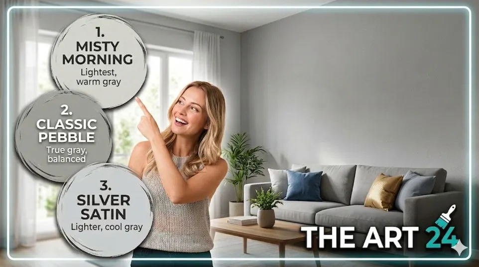
Let me talk about this specific shade because everyone asks about it. Sherwin Williams light French gray paint color (SW 0055) is one of the most searched grays right now.
I tested it in my north-facing living room. Here is my honest take.
What it actually looks like: Not gray. Not really. It is a warm greige. Gray mixed with beige. On my wall, it looked like a soft mushroom color. Very neutral. Very safe.
The good: It hides imperfections well. My living room walls have small cracks. This paint made them disappear. It also works with warm wood tones. My teak furniture looked better against this than against pure gray.
The bad: In low light, it looks muddy. My living room gets afternoon sun only. By 4 PM, the walls looked dull brown. Not the airy look I wanted.
Who this is for: South-facing rooms with lots of sun. Rooms with white trim and light flooring. People who want "barely there" color, not true gray.
Who should avoid: North-facing rooms. Rooms with dark wood furniture. Anyone who wants a cool, crisp gray.
I did not use it. Went with a cooler gray instead. But my neighbor used it in her south-facing dining room. Looks beautiful. Same paint, different light. That is the gray game.
2026 Interior Paint Colors Sherwin Williams – What Is Actually Trending?
I asked two paint store managers what real people are buying. Not what magazines say. Here is the 2026 interior paint colors Sherwin Williams trend that surprised me.
People are moving away from cool grays. No more blue-gray. No more purple-gray. The hot shade right now is greige. Gray-beige mix.
The top seller in my local store: Agreeable Gray (SW 7029). Yes, it has been popular for years. Still selling more than any new color. Why? Because it works in every room. Every light. Every floor.
The new trend I noticed: Light grays with green undertones. Very subtle. You barely see the green. But it makes the room feel organic. Calm. My friend used Sea Salt (SW 6204) in her bedroom. Looks gray in the morning. Looks slightly green in the afternoon. Beautiful effect.
What is dying: Pure cool grays with blue undertones. They look dated now. Like 2015 Pinterest. I painted my hallway Repose Gray (SW 7015) three years ago. Loved it then. Now it looks cold. I am repainting next month.
Light Gray Paint Colors Room by Room – What Works Where?
I tested different light gray paint colors in different rooms. Here is my room-by-room advice.
Living room (north-facing): Do not use pure gray. North light is already cool and flat. Gray makes it feel colder. Use a greige instead. I used Benjamin Moore Revere Pewter. Warm. Inviting. My sofas finally look right.
Living room (south-facing): You have flexibility. South light is warm and golden. It makes gray look softer. Try Sherwin Williams Passive (SW 7064). Cool but not cold. My south-facing friend used it. Her room looks like a magazine.
Bedroom: Go warmer. Bedrooms need coziness. I used Sherwin Williams Worldly Gray (SW 7043). Very light. Very warm. My white bedding pops against it. My sleep improved? Probably not. But I feel calmer.
Kitchen: Light gray on cabinets works. But test first. Kitchen light changes constantly. Morning. Noon. Evening. Artificial light at night. My sister painted her kitchen cabinets light gray. Regretted it. Looked blue under her LED lights. Repainted white.
Bathroom: Gray works great here. Especially with white fixtures. I used Sherwin Williams Big Chill (SW 7648). Clean. Crisp. Makes my small bathroom look bigger. No regrets on this one.
The Undertone Problem Nobody Explains
Let me explain undertones simply. Every gray has a secret color hiding inside.
You Must Also Like: What Is the Traditional Japanese Art of Paper Folding Called?
Blue undertone: Looks crisp and clean. But can feel cold. Best for south-facing rooms, bathrooms, modern homes.
Purple undertone: Looks soft in the store. Looks pink on your wall. Avoid unless you want a lavender room. I made this mistake. Never again.
Green undertone: Looks organic. Natural. Works well with plants and wood. My current favorite.
Beige undertone (greige): Warmest option. Works in almost every room. Safest choice for beginners.
How to spot the undertone: Hold the swatch against a pure white paper. The secret color will show itself. Against white, blue-gray looks blue. Purple-gray looks pink. Do this test before you buy anything.
I do this test in the store. Then again at home. Saved me from three bad purchases last year.
Practical Buying Guidance – Sample Pots Save Money
Here is where most people waste money. They buy gallons first. Then repaint. That costs time, money, and sanity.
My sample system (works every time):
-
Buy 3-5 sample pots. 200-300 rupees each in India. $5-10 in the US.
-
Paint a 3x3 foot square on each wall you plan to paint.
-
Label each square with the color name.
-
Wait 24 hours for the paint to fully dry.
-
Look at each square at 8 AM, 12 PM, 4 PM, and 8 PM.
-
Eliminate the ones you hate at any time of day.
-
Pick the one you love at all four times.
I did this for my bedroom. Started with 5 samples. Eliminated 3 after day one. Eliminated 1 more after day two. Painted with the last one. Perfect on the first try.
Cost of this method: 1000 rupees for samples. Saved me from buying 10,000 rupees of wrong paint. Worth every rupee.
The Lighting Lie You Need to Know
Paint stores have special lighting. Makes every color look amazing. Your home does not have that lighting.
I learned this when I bought a gray for my hallway. Looked perfect under the store lights. On my wall, under my warm LED bulbs, it looked brown. I called the store. They said "lighting conditions vary." Translation: we are not responsible.
What I do now: I bring my own light bulb to the store. Seriously. I unscrew a bulb from my home. I hold swatches under that bulb. Not under store lights. This changed everything for me.
For Indian homes specifically: Most Indian homes have warm white LED lights (2700K-3000K). Gray looks warmer under these. If you want a true cool gray, you need cool white lights (4000K+). Change your bulbs or change your color. Do not fight both.
The Furniture Problem Nobody Mentions
You picked a beautiful light gray color paint. You painted the whole room. Now your furniture looks wrong. This happened to me. I painted my living room a lovely warm gray. My beige sofa looked dirty.
My brown coffee table looked orange. I did not change the paint. I changed my lighting and added a rug.
The fix (cheaper than repainting):
-
Add a large rug that bridges the wall and furniture colors.
-
Change your light bulbs to a different temperature.
-
Add artwork with both wall color and furniture color.
-
Wait two weeks. Sometimes your eyes adjust.
I waited. My eyes adjusted. Now I love the room. But I almost repainted. Do not rush.
What to Avoid – My Regret List
I made mistakes so you do not have to.
Do not buy: The cheapest paint. I bought budget gray paint for my bathroom. Needed three coats. Still looked streaky. Had to buy expensive paint anyway. Wasted money.
Do not trust: Online photos of painted rooms. Filters. Editing. Different screens. My "perfect gray" from Instagram looked nothing like reality.
Do not skip: Primer. Gray paint over dark walls looks wrong. I skipped primer once. The old red wall showed through. Had to repaint with primer. Double work.
Do not forget: The ceiling. White ceiling with gray walls looks harsh. I painted my ceiling two shades lighter than my walls. Same color family. Much softer. Much better.
Final Verdict – My Top 3 Light Gray Paints
After testing seven grays across four rooms, here are my honest recommendations.
Best for beginners: Sherwin Williams Agreeable Gray (SW 7029). Works in every room. Every light. Every floor. Cannot go wrong. This is what I recommend to everyone who asks.
Best for south-facing rooms: Sherwin Williams Passive (SW 7064). Cool but not cold. Looks expensive. My south-facing living room never looked better.
Best for small spaces: Benjamin Moore Gray Owl (OC-52). Light. Bright. Makes rooms feel bigger. I used this in my powder room. Best decision I made.
What I personally used in my bedroom: Sherwin Williams Worldly Gray (SW 7043). Warm. Calm. My wife loves it. I love it. The dog sleeps against the wall. That is the real test.
What I regret: Trying to match a blogger's photo. Her light, her furniture, her camera. Not my home. Never again.
You searched for light gray paint colors because you want a beautiful home. Not a stressful project. Take my advice. Buy samples. Test for three days. Look at the wall in every light. Then buy the gallon.
One last thing. Paint looks different wet versus dry. Do not panic when you first roll it on. Wait 24 hours. Then judge. I panicked three times. Calmed down three times. The color was fine. My anxiety was the problem.
Save this page. Share it with someone painting their home. And for the love of good design, buy samples first.

